Web Development
Damien Schneider
How to make a Vercel-like navigation using ReactTS, Tailwind, and Framer Motion
Sunday, August 4, 2024
TLDR
In this tutorial, we built a Vercel-like navigation menu using ReactTS, Tailwind CSS, and Framer Motion. The key steps include:
Project setup: Create a React project with TypeScript and install Tailwind CSS and Framer Motion.
Component creation: Build the navigation component with React, managing hover states with React hooks.
Implement animations: Use Framer Motion for smooth hover animations.
Styling: Apply Tailwind CSS classes for responsive and aesthetic design.
Reusability: Make the component reusable by parameterizing button data.
By following these steps, you can create a customizable and robust navigation menu with smooth animations, enhancing your web application's user experience.
The component Demo can be found at CuiCui.day
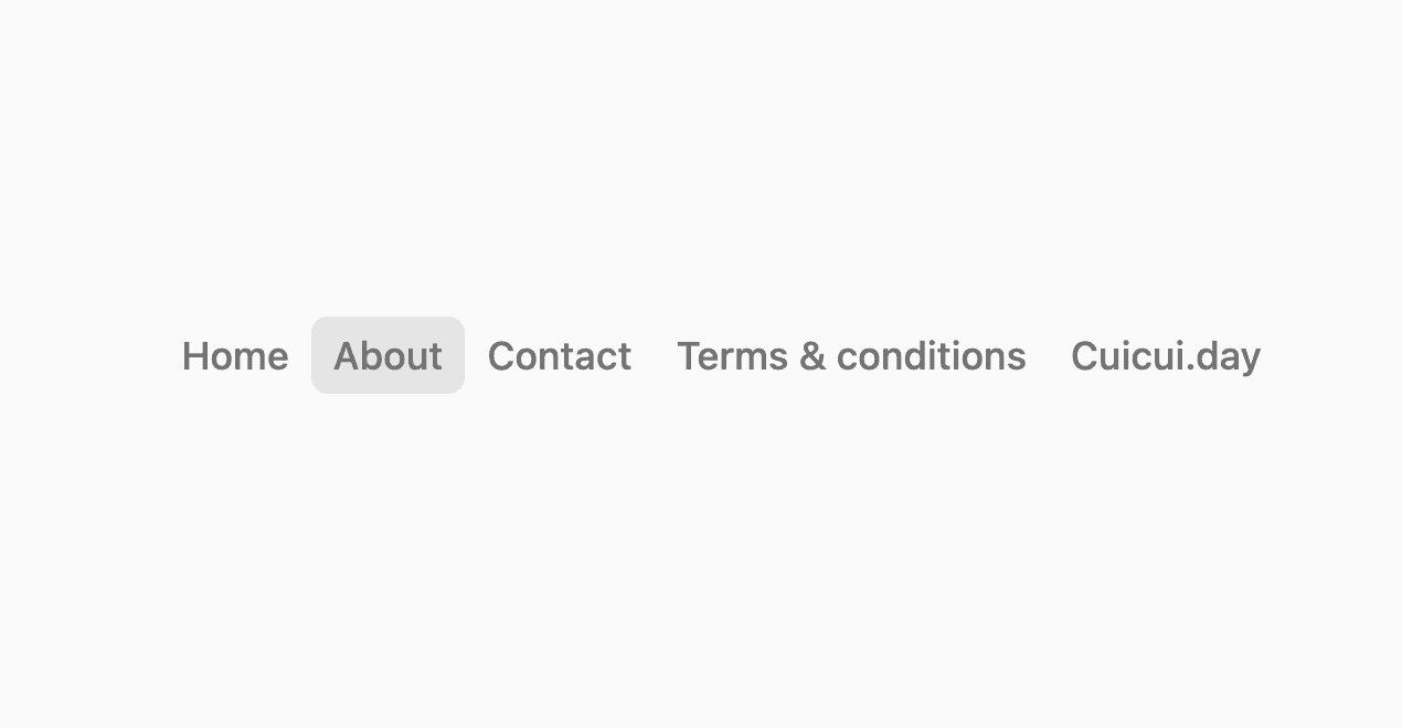
Creating a sophisticated and smooth navigation menu similar to Vercel's can significantly enhance the user experience of your web application. In this tutorial, we will walk through building a customizable and robust navigation menu using ReactTS, Tailwind CSS, and Framer Motion. Whether you're a beginner or an advanced React developer, this guide will provide you with best practices and detailed steps to achieve a seamless navigation experience.
Introduction
Navigation menus are crucial for any web application as they guide users through the content and functionalities of the site. A well-designed navigation menu can make a significant difference in user experience. In this tutorial, we'll build a navigation menu inspired by Vercel's elegant design, using ReactTS, Tailwind CSS, and Framer Motion.
How It Works
The navigation menu we'll create features buttons that change appearance when hovered over, thanks to Framer Motion's animation capabilities. Each button will have a smooth animation effect, providing a responsive and visually appealing experience. Tailwind CSS will help us style the components efficiently, while ReactTS will manage the component logic and state.
Best Practices
To ensure the navigation menu is robust, reusable, and maintainable, we'll adhere to the following best practices:
- Componentization: Break down the navigation into smaller, reusable components.
- State Management: Use React's state hooks to manage active elements and hover states.
- Responsive Design: Use Tailwind CSS to ensure the navigation menu is responsive across different screen sizes.
- Performance Optimization: Utilize Framer Motion for smooth animations without compromising performance.
Step-by-Step Guide
Setting Up the Project
First, set up a new React project with TypeScript, Tailwind CSS, and Framer Motion. If you don't have these tools installed, you can follow these steps:
1. Create a new React project with TypeScript:
2. Install Tailwind CSS:
Configure Tailwind in `tailwind.config.js` and add the necessary styles to `src/index.css`.
3. Install Framer Motion:
Creating the Navigation Component
Create a new file VercelNavigation.tsx in the src/components directory and add the following code:
Implementing Animations
We use Framer Motion's `AnimatePresence` and `motion.div` components to handle the animations. The `motion.div` is conditionally rendered when a button is hovered, creating a smooth scaling and opacity transition.
Styling with Tailwind CSS
Tailwind CSS classes are used to style the navigation and buttons. Here’s a breakdown of the applied styles:
- flex flex-col sm:flex-row: Makes the navigation responsive, changing from a column layout on small screens to a row layout on larger screens.
- text-neutral-500 text-sm font-medium py-1 px-2 rounded relative whitespace-nowrap inline-flex w-fit: Styles the buttons with neutral text color, padding, rounded corners, and ensures they fit their content.
Making It Reusable
To make this component reusable, parameterize the button data and styles. This allows you to easily customize the navigation for different projects.
Now, you can use this component anywhere in your application by passing the button data as props:
Conclusion
In this tutorial, we created a Vercel-like navigation menu using ReactTS, Tailwind CSS, and Framer Motion. We explored how to manage state, implement animations, style with Tailwind CSS, and make the component reusable. By following these steps, you can enhance your web applications with a smooth and visually appealing navigation menu. Happy coding!
Apprendre React en 15 concepts clés – Guide Complet
Web Development

Pourquoi tous les devs Tailwind doivent utiliser la fonction CN
Web Development
How to make a Vercel-like navigation using ReactTS, Tailwind, and Framer Motion
Web Development
